The Input Dropdown Node allows your clients to choose choices from a dropdown menu. We’ll walk you through tailoring the Dropdown Node to your needs in this lesson.
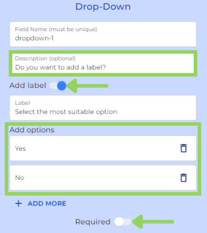
Step 1: Change the Field Name
As with any other node, you can modify the field name of the Dropdown Node for internal reference. Keep in mind that this field name will not be visible to the user in the frontend.
Step 2: Add a Description (Optional)
Next, you add some explanations in the front end for your client, just write a brief description in the optional description box.
Step 3: Label toggle (Optional)
Also, if you’d like to provide additional information for the user, you can toggle the “Label” to add a commentary at the top of the dropdown as a way of explaining the user purpose of the dropdown.
Step 4: Enter Dropdown Options
Input the options you want to include in the dropdown menu. As a pro tip, pressing the “Enter” key will automatically create a new option.
Step 5: Toggle the “Required” Option (Optional)
You can decide if the Dropdown Input is mandatory by enabling the “Required” option.
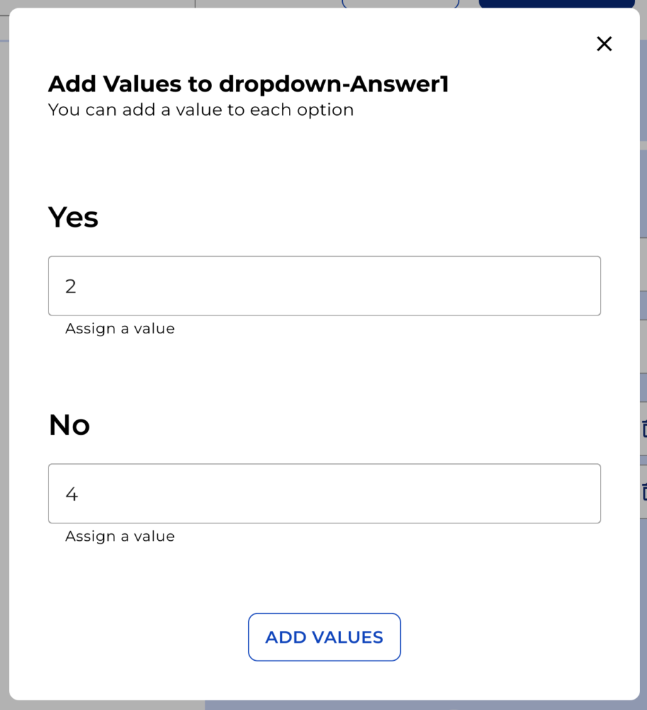
Step 6: Add Values or Categories to Options (Optional)
For each option, you can assign values or categories that can be used in Logical Conditions or the Calculation Node. Simply add the values or categories and click on “Add values.”
If you need more information about those nodes, you can watch “Logical Condition Tutorial” or “Calculation Tutorial”.
Remember to click on “Preview” in the top menu to see how your bot will appear to your clients. This helps in making any necessary adjustments before implementation.
Happy automating with e! See you soon!